You may have noticed that many of our projects call for a natural look, with rambling streams, randomly placed boulders (just like nature does it) and layered flowers. However, we are in the business of giving our clients the look they want for their yards, so when one approached us to create a neat and clean landscape design, we were happy to oblige.
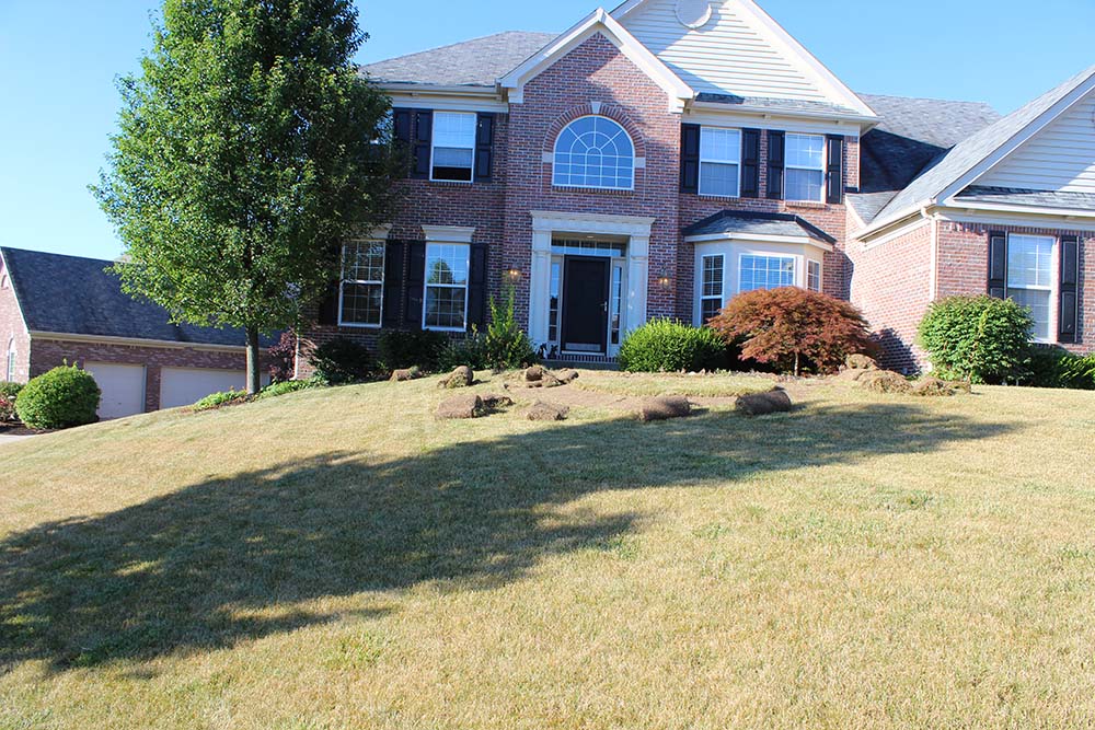
When our client purchased his home, it needed a lot of work, inside and out. First, he focused on the interior, and then called us when he was ready to tackle the exterior. The landscaping was overgrown, hiding the house from the street and walkways. We began by removing all the bushes and the sidewalk, creating a clean palette on which to build.
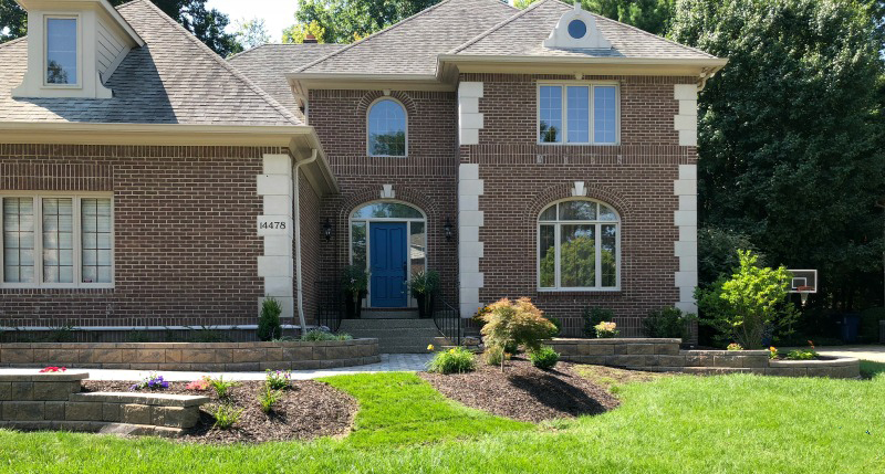
The goal of the landscape design was to improve the home’s appearance, offering neat and crisp curb appeal. We achieved this look by adding clean lines, simple plantings, and materials that complemented the house.
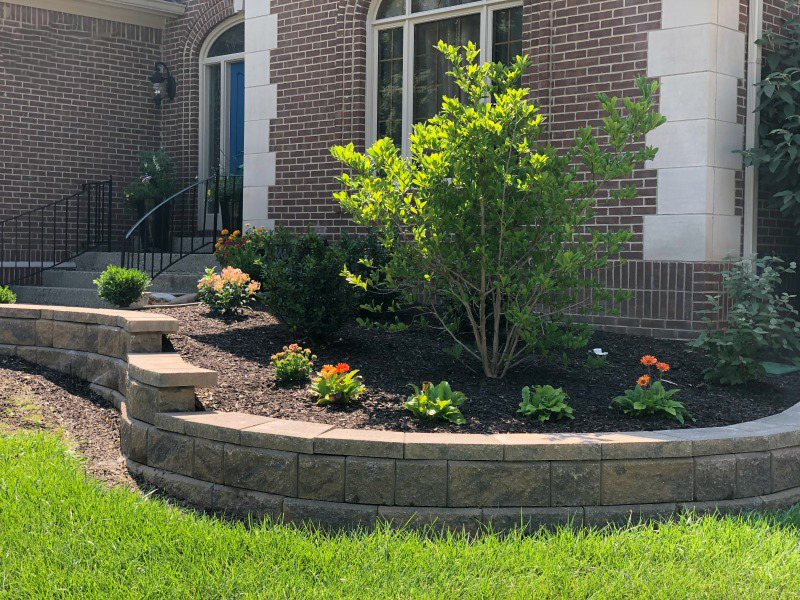
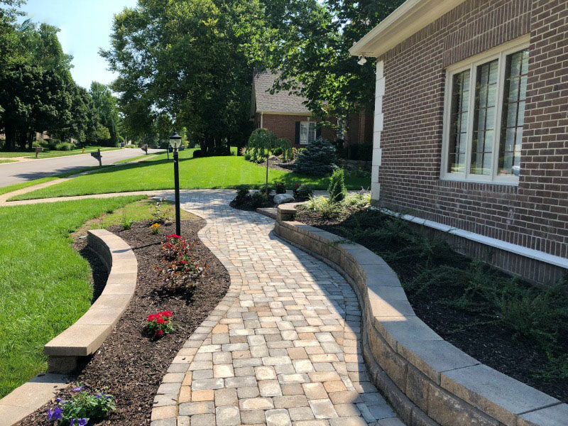
Our client discovered modular stone at a neighbor’s home and liked the look. We installed knee walls from this man-made material along the front of the house. Since there were no existing drainage issues in this area they served as a purely decorative feature, providing the elegant look our client was looking for. He did not want the natural feel of stone or boulders, so this design was the perfect solution. The walls were capped with a material that mimicked the limestone on the house.
For the sidewalk, we designed a meandering layout to add some visual interest to the hardscape. The width is slightly larger than usual because the path leads visitors along the knee wall. Have you ever noticed that people do not like walking close to walls? We tend to veer toward the street rather than a building while on a sidewalk. Therefore, we added 6 inches to the width to keep people comfortable. The sidewalk was crafted from concrete pavers in squares and rectangles in a Muster K pattern. This design offered enough variance to be visually interesting without overwhelming. The colors were chosen to blend with the brick and limestone corner pieces on house.
The plantings were meant to be simple while adding color throughout the seasons. We placed a linden tree in the front yard; our client did not want a maple tree since everyone else had one, he was not a fan of oak, and he liked the shape of the linden. We also added a star magnolia, weeping cherry, and Japanese maple for an accent. Evergreens consisted of holly and dwarf yew. Finally, for spring and summer color, we added daylilies and shrub roses.
Similar to many European gardens, the manicured look can be beautiful too. Our neat and clean design not only lends a more formal look to our client’s home but is also easy to maintain. The next phase of the project is the backyard, which we hope to complete next year. Stay tuned!
If you have questions about this project or have some landscaping to do at your own home, send us an email or give us a call at (317) 997-4803.

